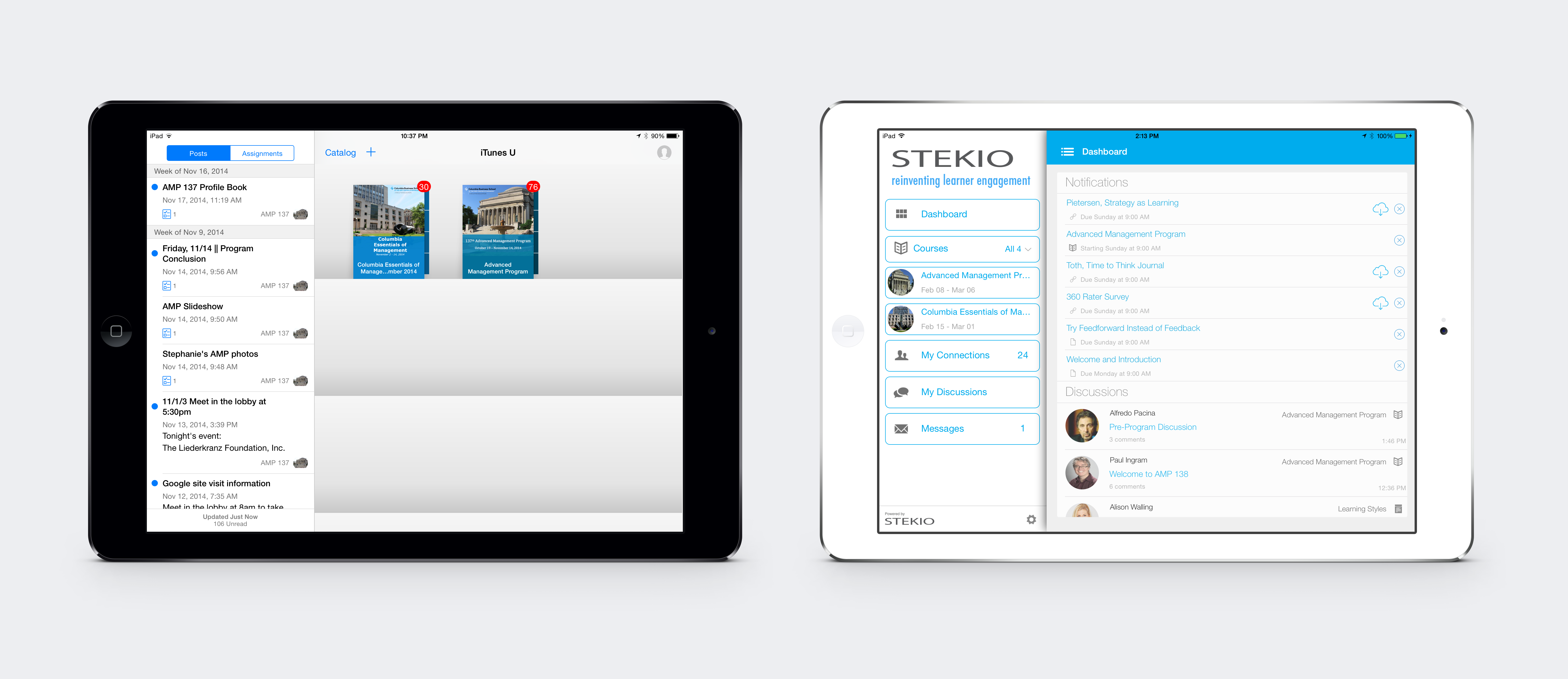
iTunes U. The iTunes U dashboard setup is similar to what you would expect from anything within the iTunes family – but for many learners, familiarity with the system won’t necessarily be a plus. A relatively elegant method of storing songs or photos doesn’t translate well to learning management. You need to scroll down the Posts menu on the left side to sort between a somewhat confusing mix of classes, slideshows and photos that for most folks, will not be organized in a particularly easy-to-find manner. This hodge-podge of data makes it a bit tricky to find something unless you’ve already got a good idea of where to look.
STEKIO. Using the simple, expandable list of options in this dashboard makes it easy to sort through courses, connections, discussions and messages. Veterans of top Customer Relationship Management software like SalesForce, Content Management Systems like WordPress or MailChimp, or popular project management software like Asana (which altogether probably includes most learners in any program today) will also find much that is familiar in STEKIO’s dashboard. The interface is just more intuitive, saving time and effort for administrators and learners alike.


